End-to-end
B2C
0->1
2025
Career Community
Empowering designers in negotiating salaries though salary transparency
My Role
Senior Product Designer
The team


Timeline
8 months
CHALLENGE
Designers lack relevant salary data
UX Unite members lack reliable salary data for UX roles in Denmark, and many designers are underpaid and struggle to negotiate fair compensation. To add to the confusion, different job titles are often used interchangeably.
They want to give their members trustworthy data without the operational costs of producing a yearly manual report, and hope to grow the community.
Results
%
Comprehension rate
All test users interpreted the design correctly in final usability testing rounds.
Reduced operational cost
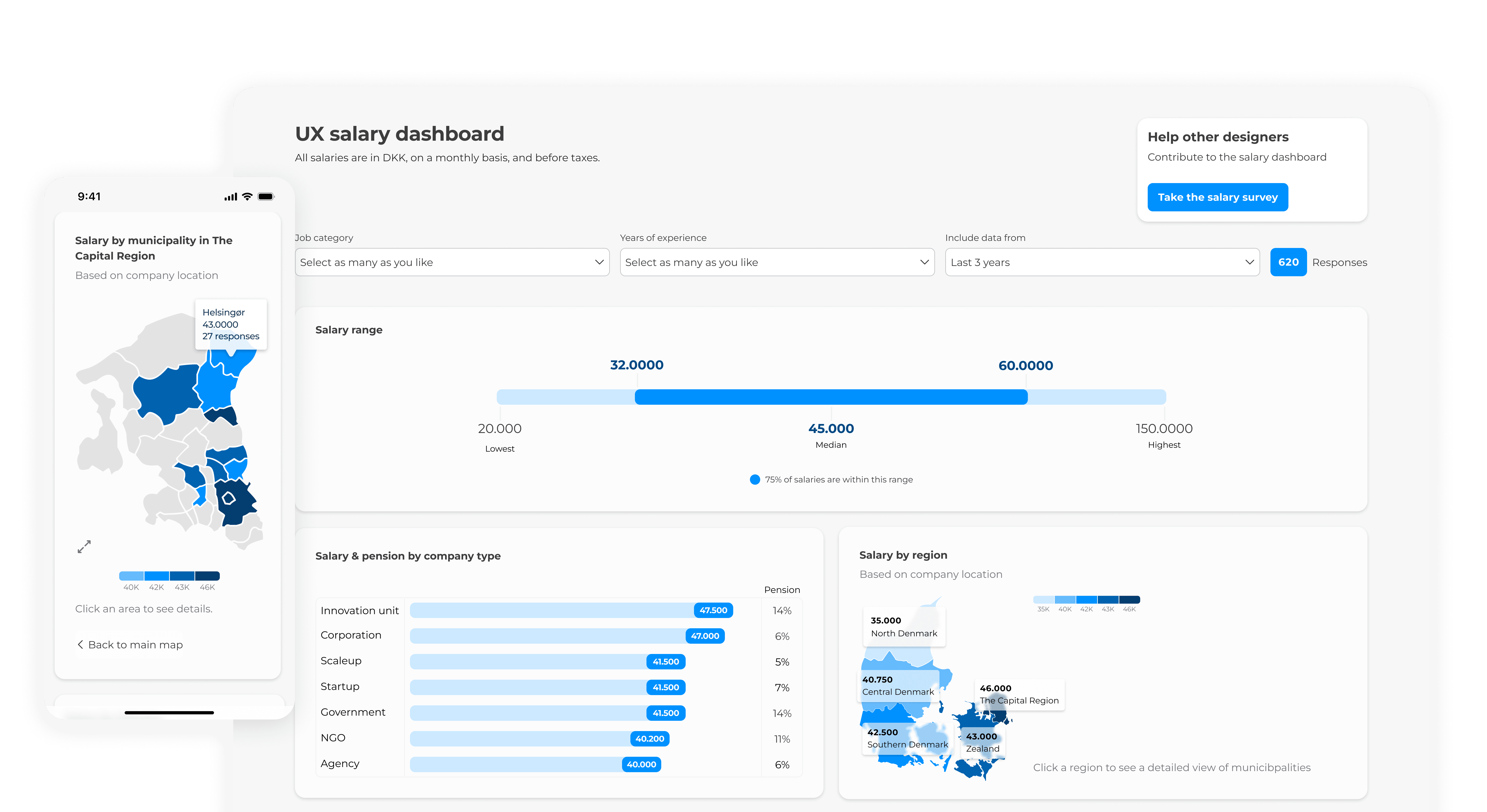
A dashboard with synchronised data from a live survey.
Positive user feedback
Users found the design, calm, useful, easy to understand.
Survey
Skills say more than job titles
Before starting interviews, I wanted to identify broader patterns with surveys. In open-ended responses, 25% noted that industry relevance was significant to them. They ranked the "most valuable data" as: 1) years of experience, 2) skills, and 3) job titles. They also reported an average confidence level of 2.7 out of 5 in negotiating, highlighting the need for support.
The survey indicated that job titles alone lack sufficient context for designers.
intertviews
Inconsistent job titles harm salary transparency
"I would love to know the main responsibilities so I can get an impression of(...) could I even compare myself?"
Quote from interview
First wireframe
Turning constraints into direction
We were on the same page about which data to include, but the dashboard needed to be "done yesterday". Since "responsibilities" and "industry" were new data points that we hadn't collected yet, they had to be set aside for now. Instead, I emphasized the data that was already available while making room for the new data points to be implemented smoothly when they would be ready.
To give as much relevance as possible, we created filters on "job category" and "years of experience".
First Hi-Fi wireframe of the dashboard


Exploration & iterations
Making data easy to understand, fast.
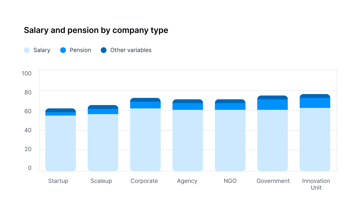
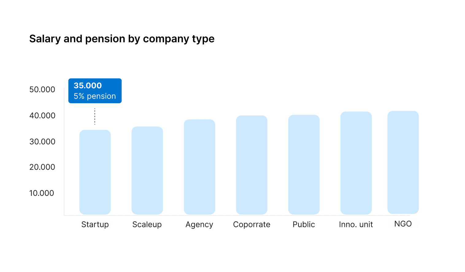
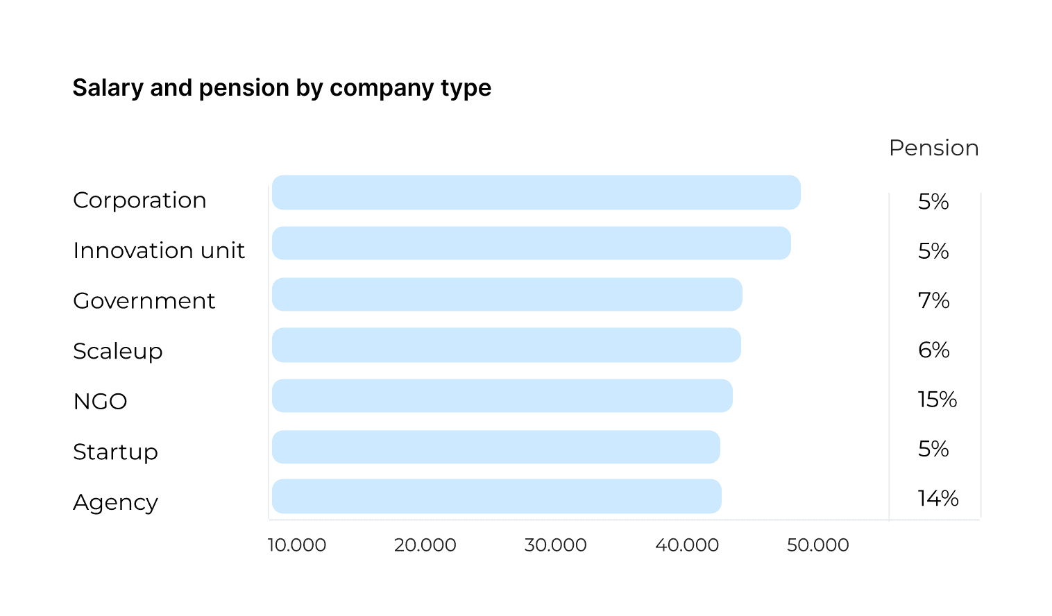
I tried out different card designs, focusing on making the data easy to read. After feedback from our PM and data analyst, I went with vertical bars and put pension in its own column.
V3 gives a clear, quick overview of both pension and base salary.
3 variations of the same salary data
V1
Stacked bar giving relative overview of the average salary
V2
Simple bars with hover view of pension and base salary
V3
Immediate overview of base salary + pension.
_
Reality checking design with actual data
Before moving on, I wanted to see how the design actually worked with our own data. It became clear that our filters were slicing things up too much — we just didn’t have enough data. Since research had already shown that designers don’t see job titles as a good reflection of their role, I suggested merging some of the job categories. Some teammates worried this might make a few designers feel less represented by the titles.
Instead, we gave designers the choice: they can combine categories with multi-select filters to get more meaningful results when they need them.
The bell curve with filters "UX Designer" + "1 Year"

Giving context to combined data categories
The multi-select feature brought up a new question: how do we help designers understand what’s actually behind the combined categories?To give more context, I added a data pool section that shows what the filtered data is made of.
I also used this space to introduce responsibility data, so it could slowly grow over time without taking focus the main dashboard.
First version of card showing information on filtered data.

Usability testing
The bell curve isn't ringing any bells
For the usability testing, I was curious about designers' reactions to the multi-select option in the filters and their understanding of the bell curve. The bell curve confused all except one designer, and many got confused or misinterpreted the chart. The data pool was mostly understood with some users reacting very positively to it.
The majority were happy using the multi-select option, while a few didn't notice it as an option.
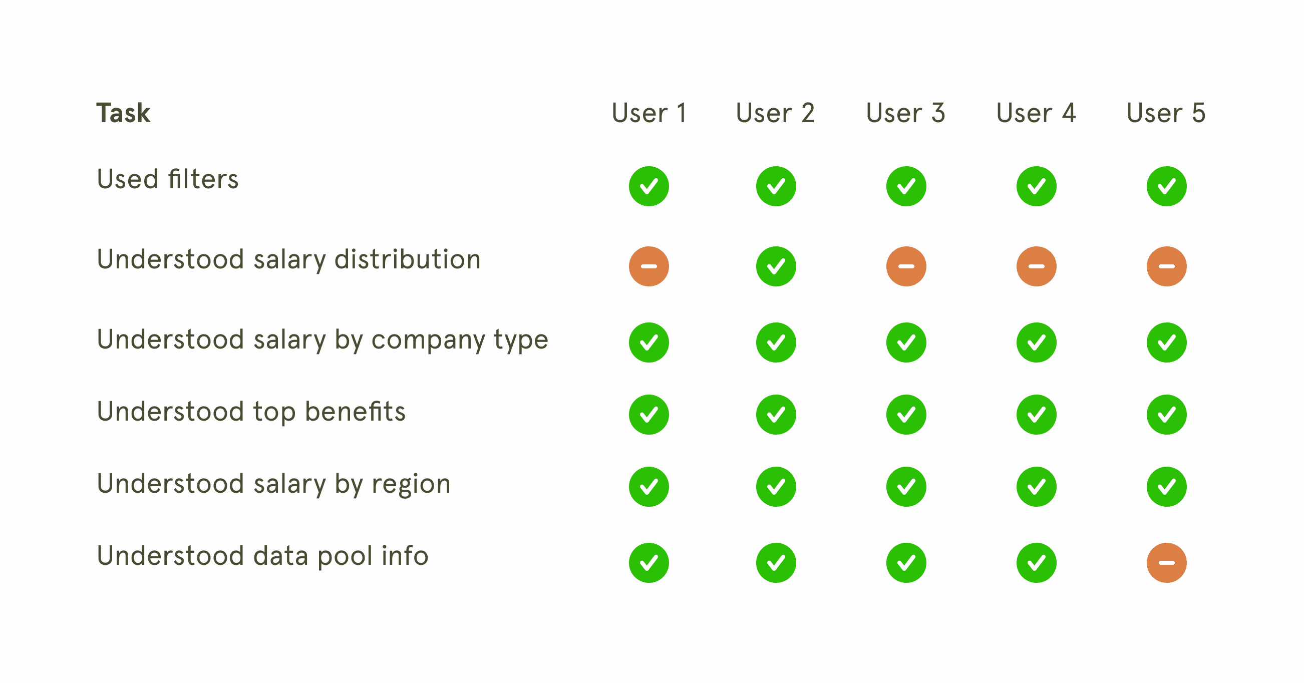
Most appreciated the ability to multi-select job categories.
Most expressed usefulness of data pool info.
Noone found the top benefits relevant.
One user misunderstood the data pool info.
Iteration
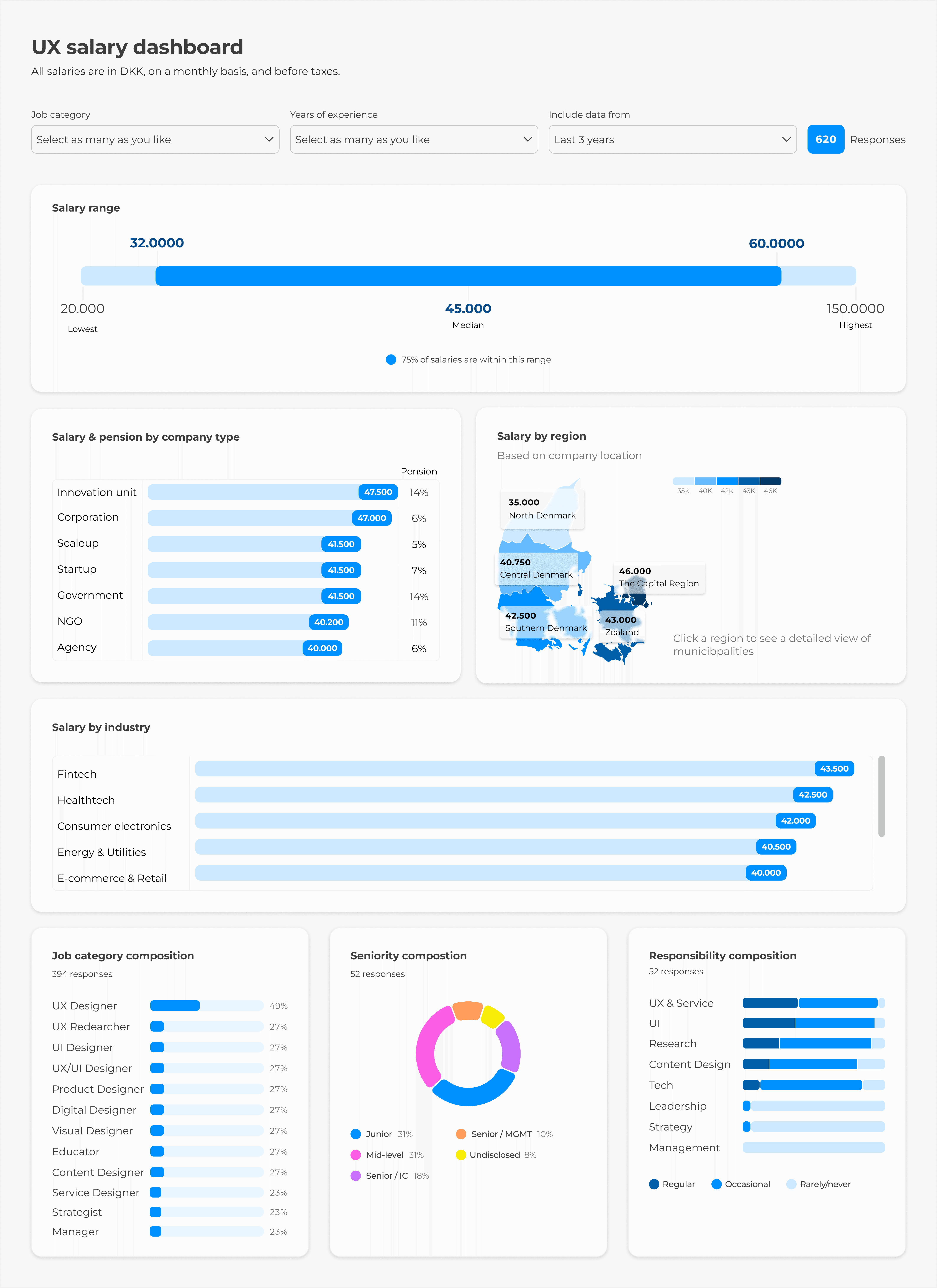
Simplifying salary range achieving 100% clarity
At first I thought about just adding labels to the bell curve, but in the end I switched to a simpler box‑plot style graph. It highlights the middle 50% range, the median, and the lowest and highest salaries with clear labels, so people get all the details they care about in one view. That also meant we no longer needed the extra helper cards.
In testing, everyone understood the simplified bar.
LeARNINGS
Knowing when to listen and when to lead
It's always a delicate dance finding common ground when people have differing views. I always want to give room for others' views, but I need to back my own views more. Often it's not the best idea, but the one that sounds most convincing that gets picked.
Visuals aid communication
While my research revealed clear user needs, I experienced resistance. I saw how visual presentations illustrating the problem/consequences made the biggest impression. It's worth the extra prep time to really think through how to make it click in people's heads.