Engaging business professionals in learning experiences
End-to-end
B2B2C
0->1
2023
Edtech
My Role
Product Designer
The team


+3 devs
Timeline
12 months
CHALLENGE
Designers lack relevant salary data
Minders was a startup providing professional educators with tools to help course participants maximise their learning. They aimed to design learning experiences with high engagement and completion rates utilising spaced repetition, active learning, and social elements, setting them apart from their competition.
NB: this project has been reskinned to reflect my current visual skill level.
Results
%
Raised user satisfaction
I raised user satisfaction by 29% (n=40) from version 1 to version 2 through testing and redesigns.
%
Completion rate
In a free-access and voluntary cohort.
Feature adoption
Non-empty engagement with all features, including polls, journals, and buddy discussions.
Research
Course participants
forget
~75% in a week
This is especially true of complex information delivered in long, passive learning sessions (source: forgetting curve). Interviews I had with customers confirmed that they struggle to help course participants retain what they learn long-term. Course participants expressed that “life takes over” and that finding time to revisit course material during and after a course is difficult.
Eventually, the learnings from costly courses gets lost.
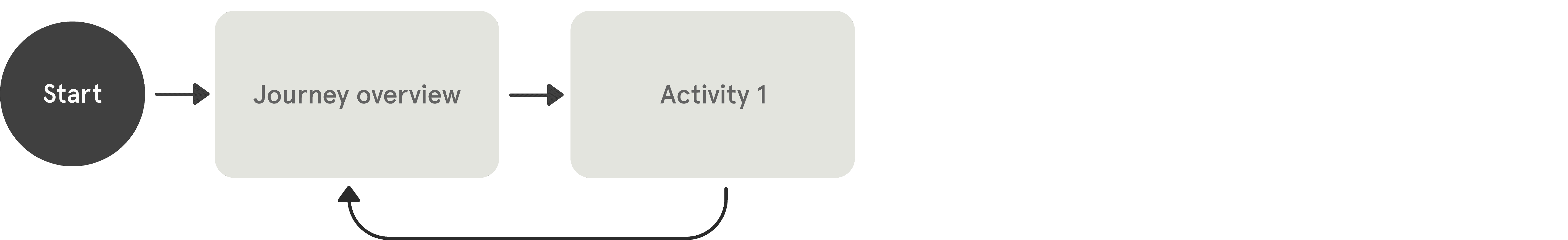
Design
Designing microlearning with a social twist
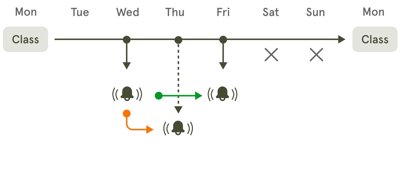
An example scenario of the notification engine supporting spaced repetition.
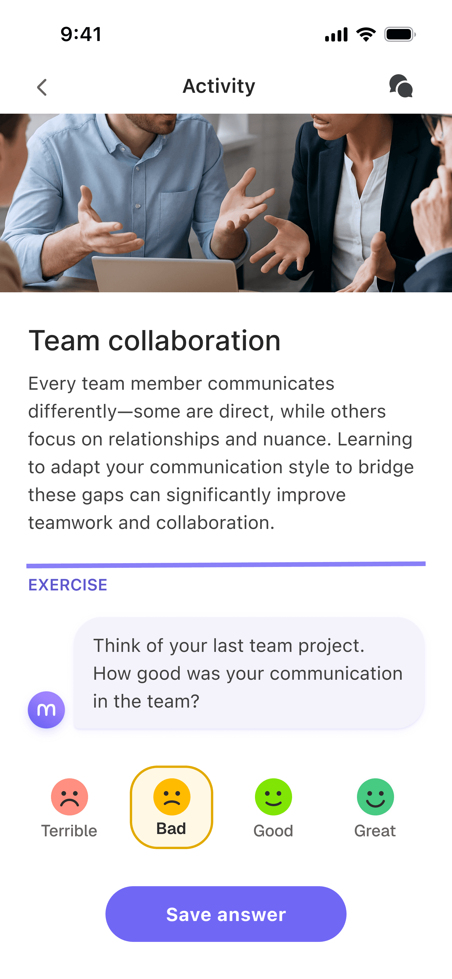
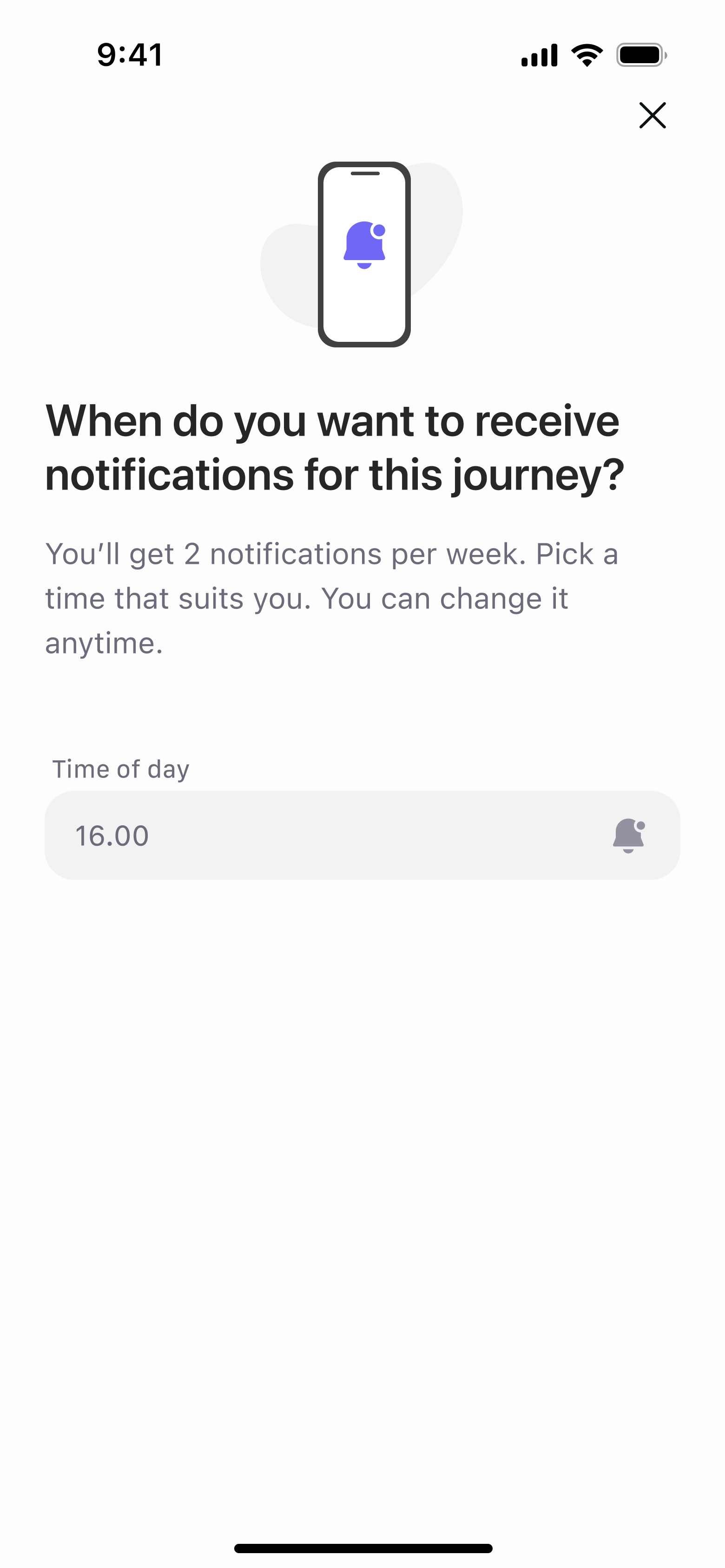
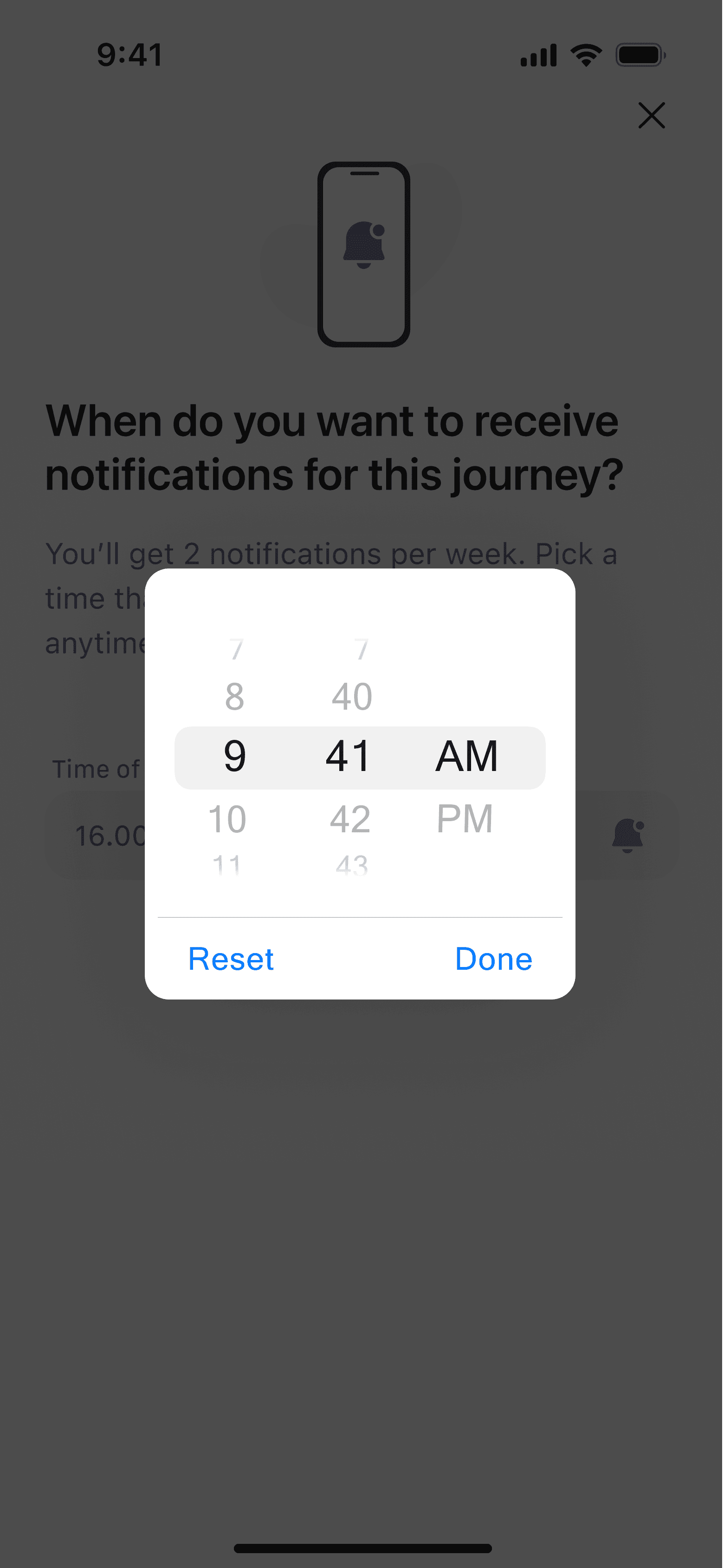
Journey settings
Gives flexibility to decide when learning fits into their day.
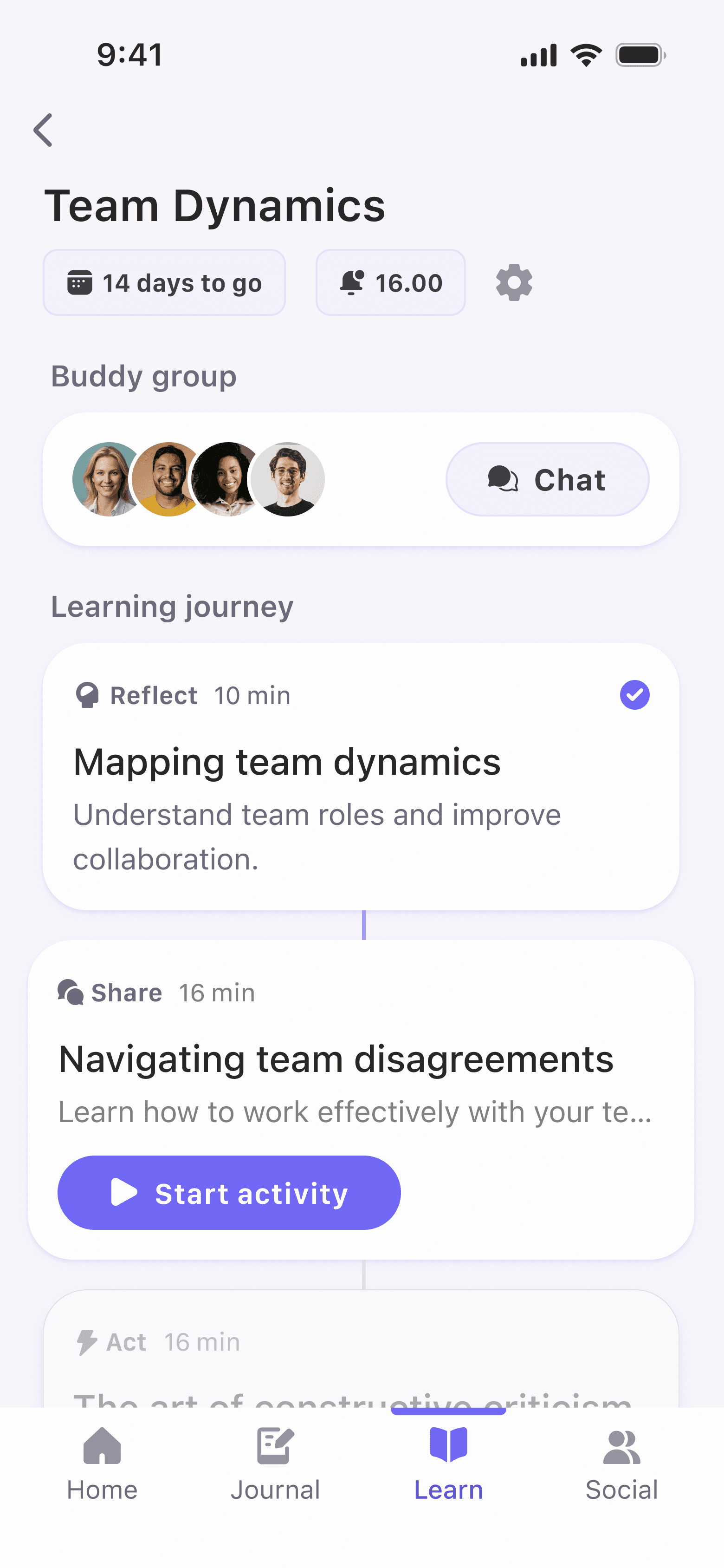
Visual completion indicators
Motivates and creates a sense of progress.
Categorized activities
Reduces cognitive load and allow users to quickly identify what kind of content they’re about to engage with.
Dimmed activities
Keeps users aware of upcoming content without distracting from current tasks. Builds anticipation.
Time constraints
Helps users understand commitment at a glance.
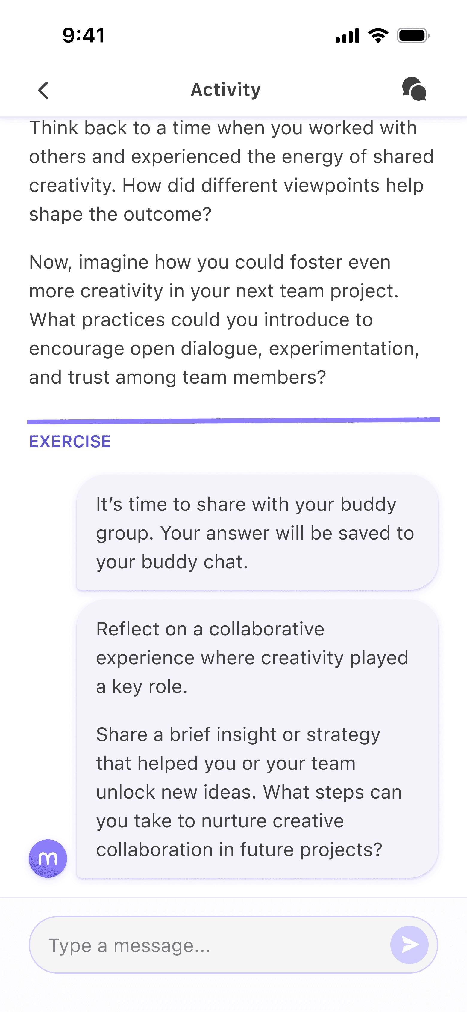
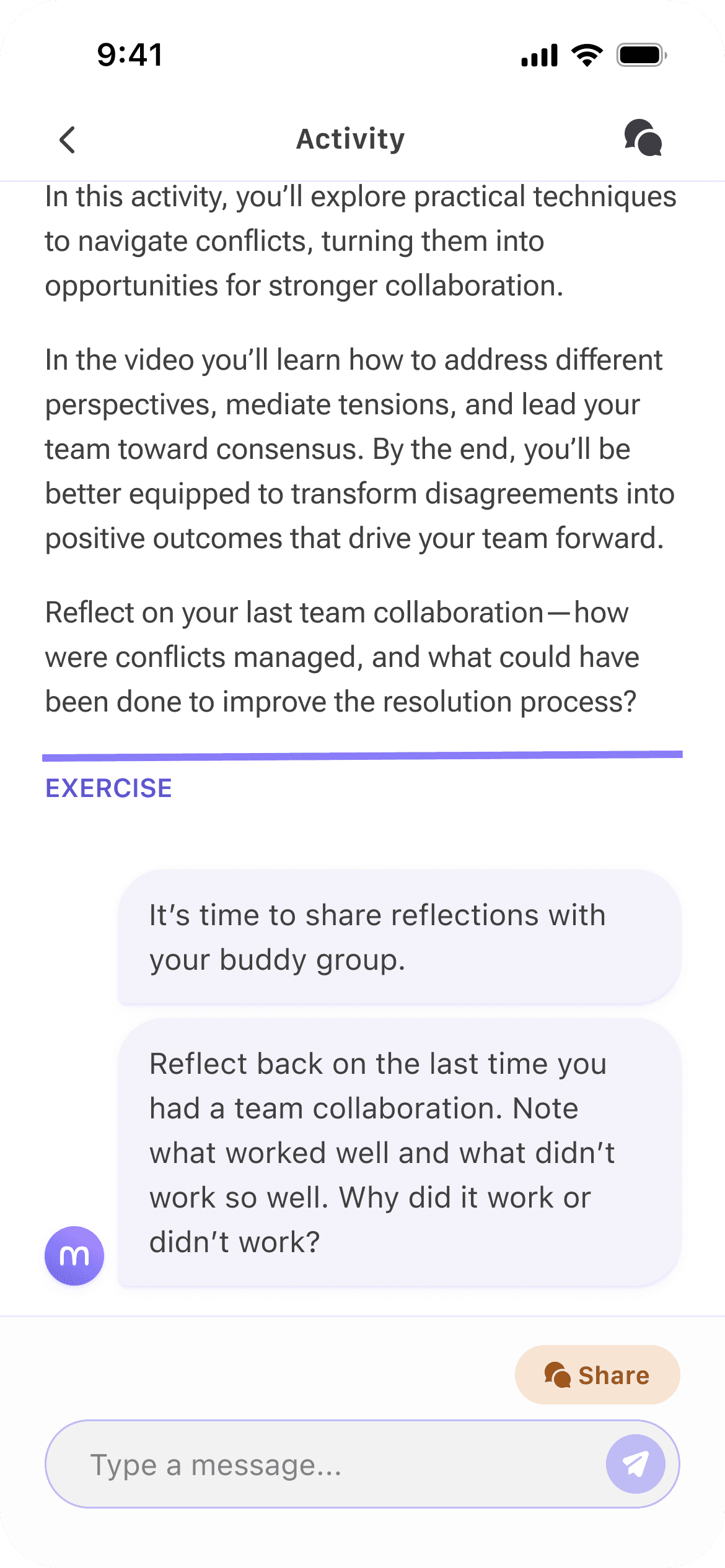
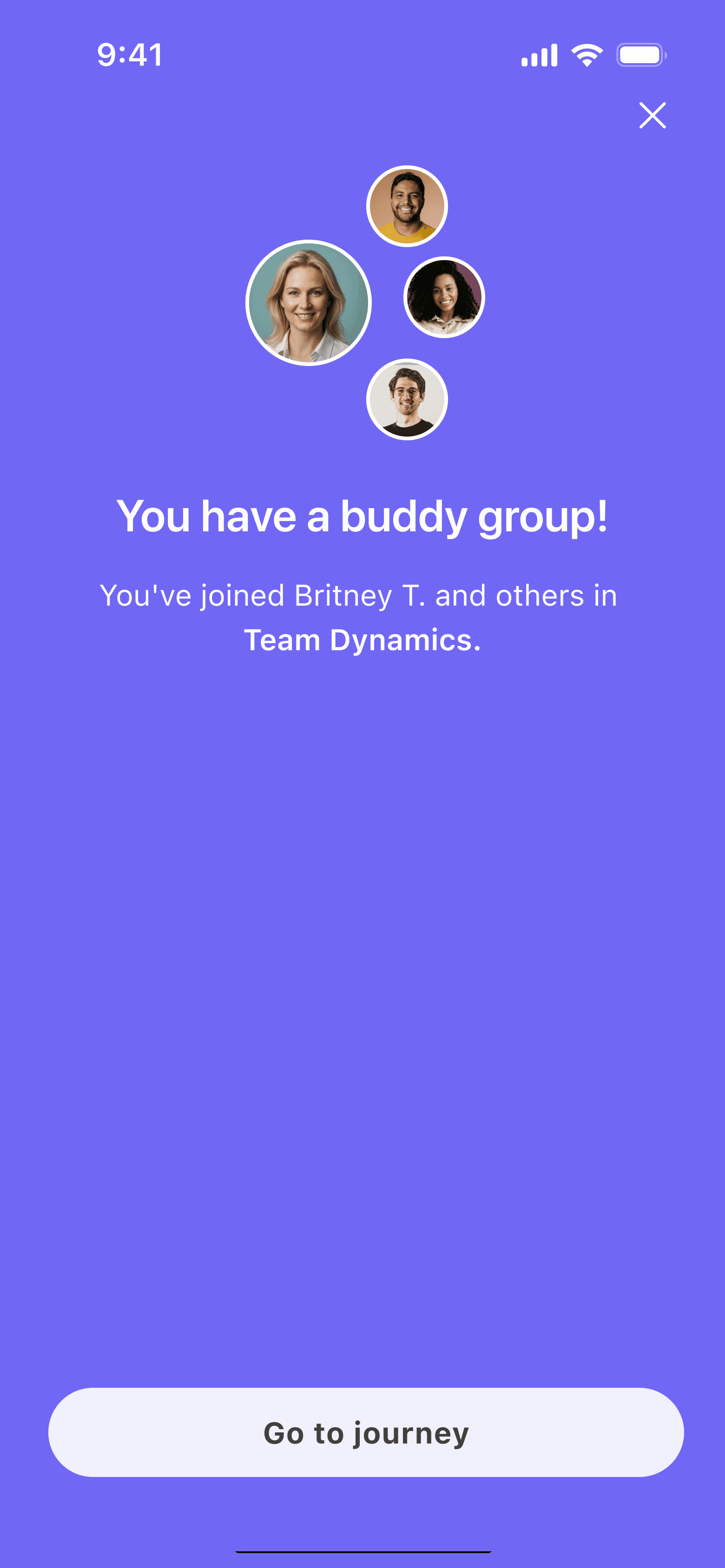
The tricky part: adding the social layer
While microlearning isn't a new phenomenon, it was much trickier to figure out how to make it possible in a group setting. We wanted to create an exercise where course participants could share perspectives with others from the course. The interactions had to be meaningful and without causing friction in the learning journey flow.
I briefly explored directing users to the buddy chat to submit their answers, but decided to keep everything on the activity screen to preserve a smooth, uninterrupted flow.
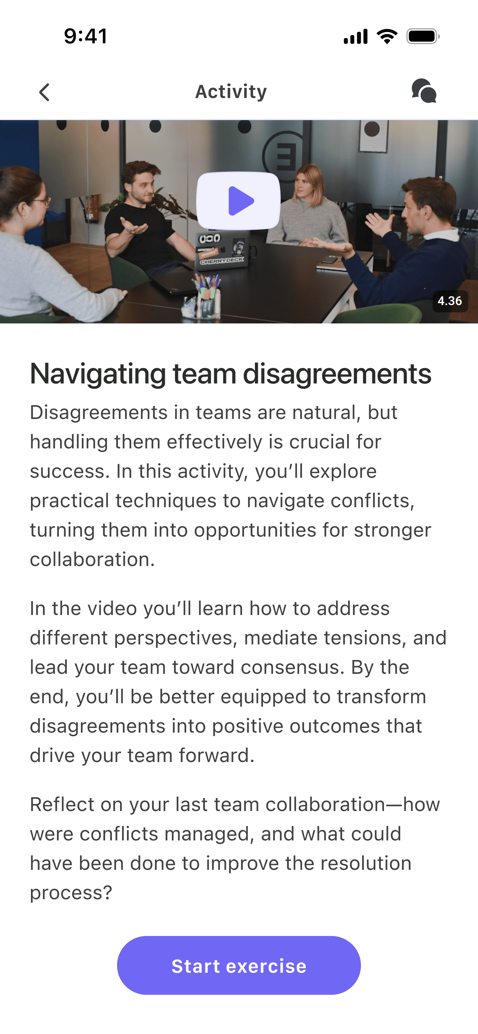
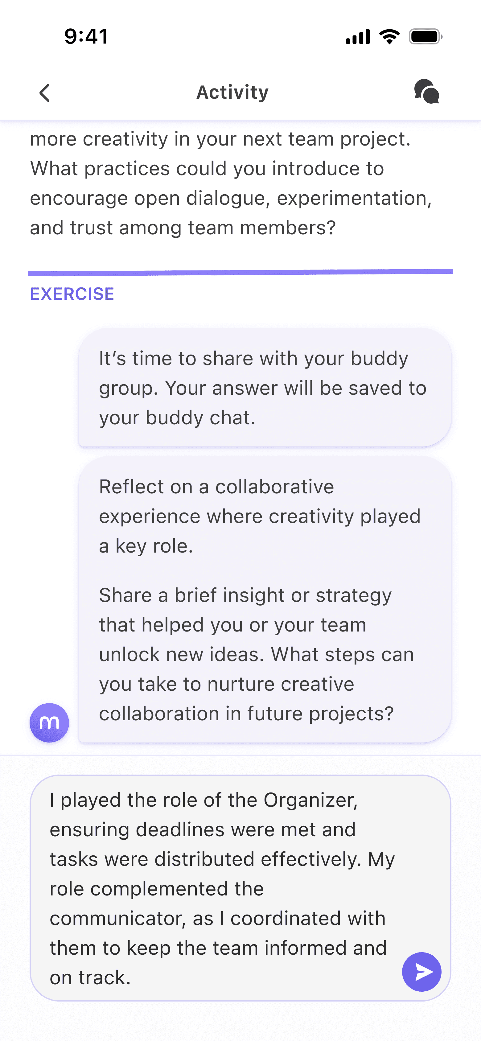
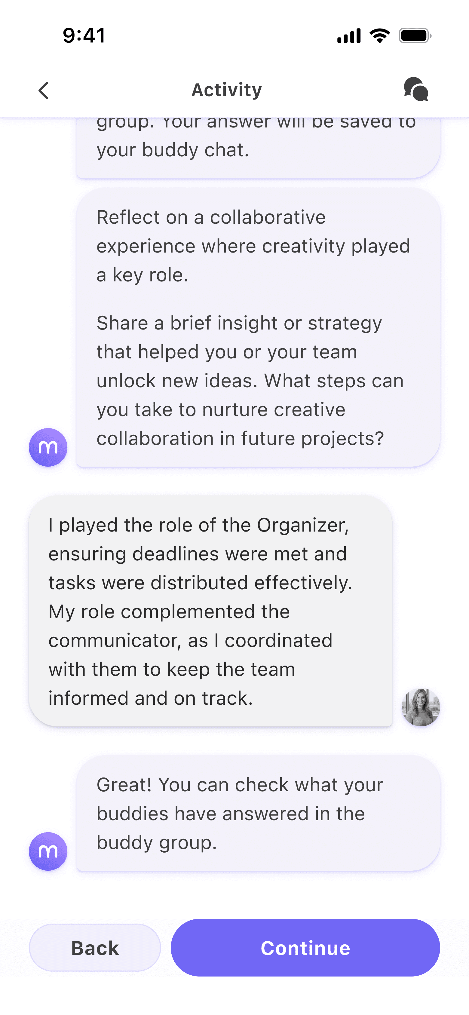
Activity with buddy exercise
Smiley
A quick reflection allowing for fast feedback while keeping the momentum going.
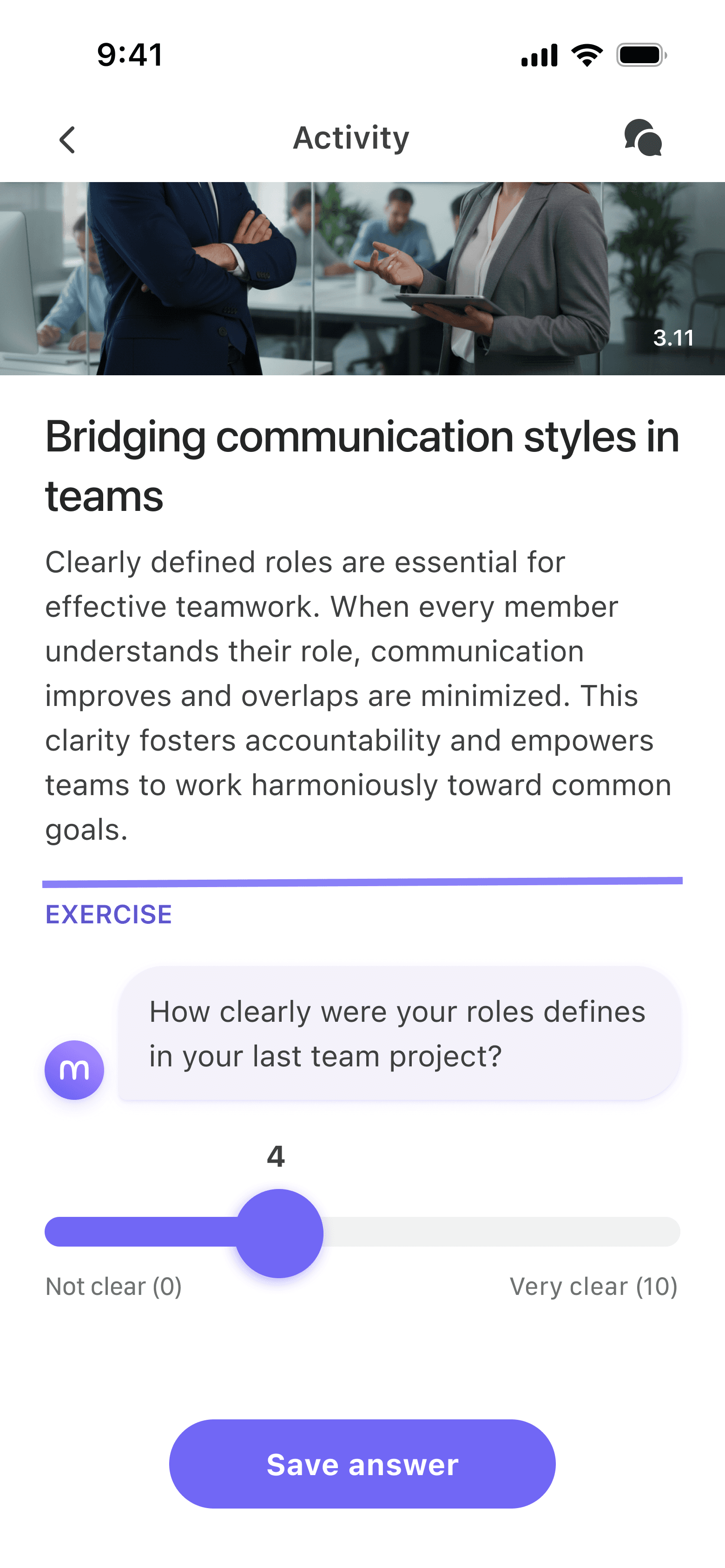
Scale
Similar to smiley but more versatile use with custom labels.

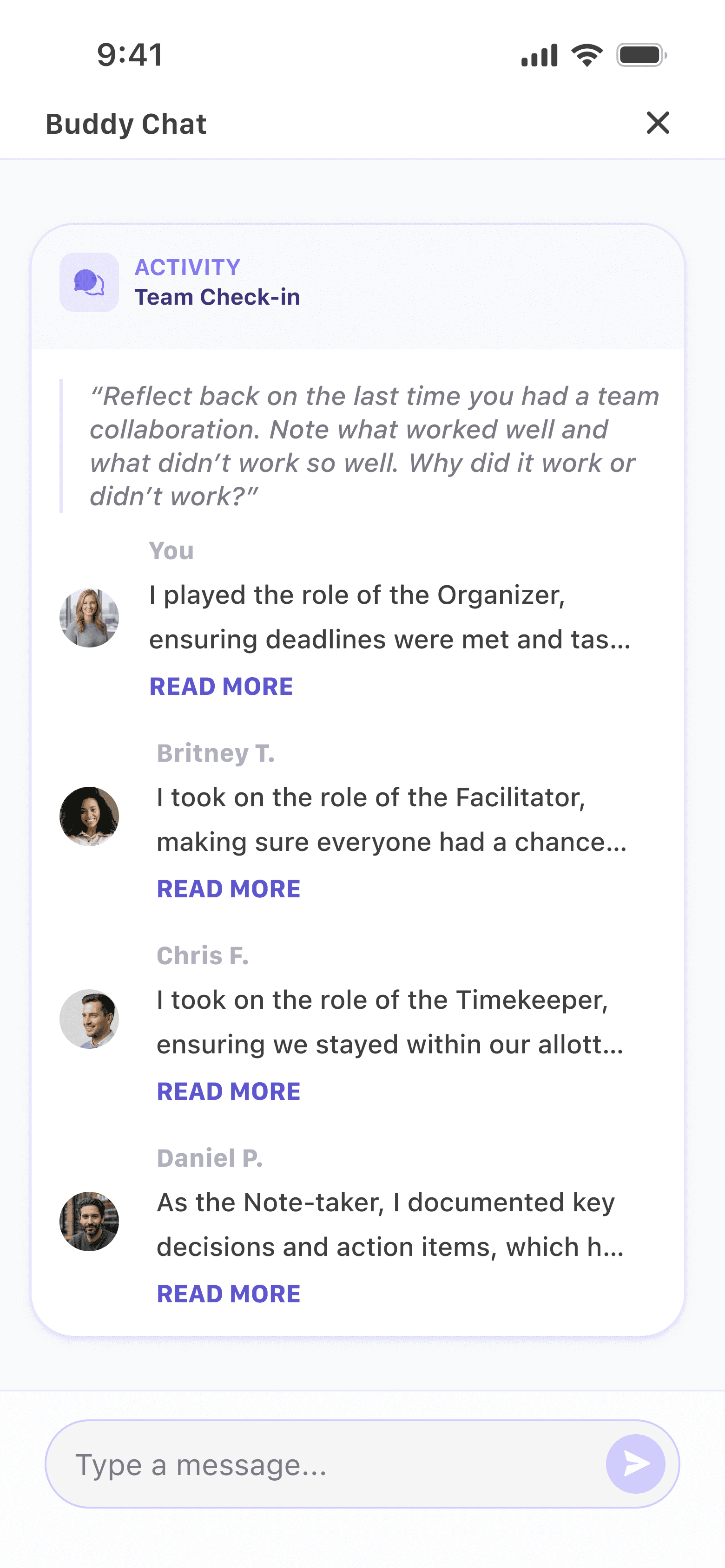
Poll
Shows previous answers from other users to give participants perspective and makes the app feel more alive. I chose an accessible color palette with white borders for the donut chart.
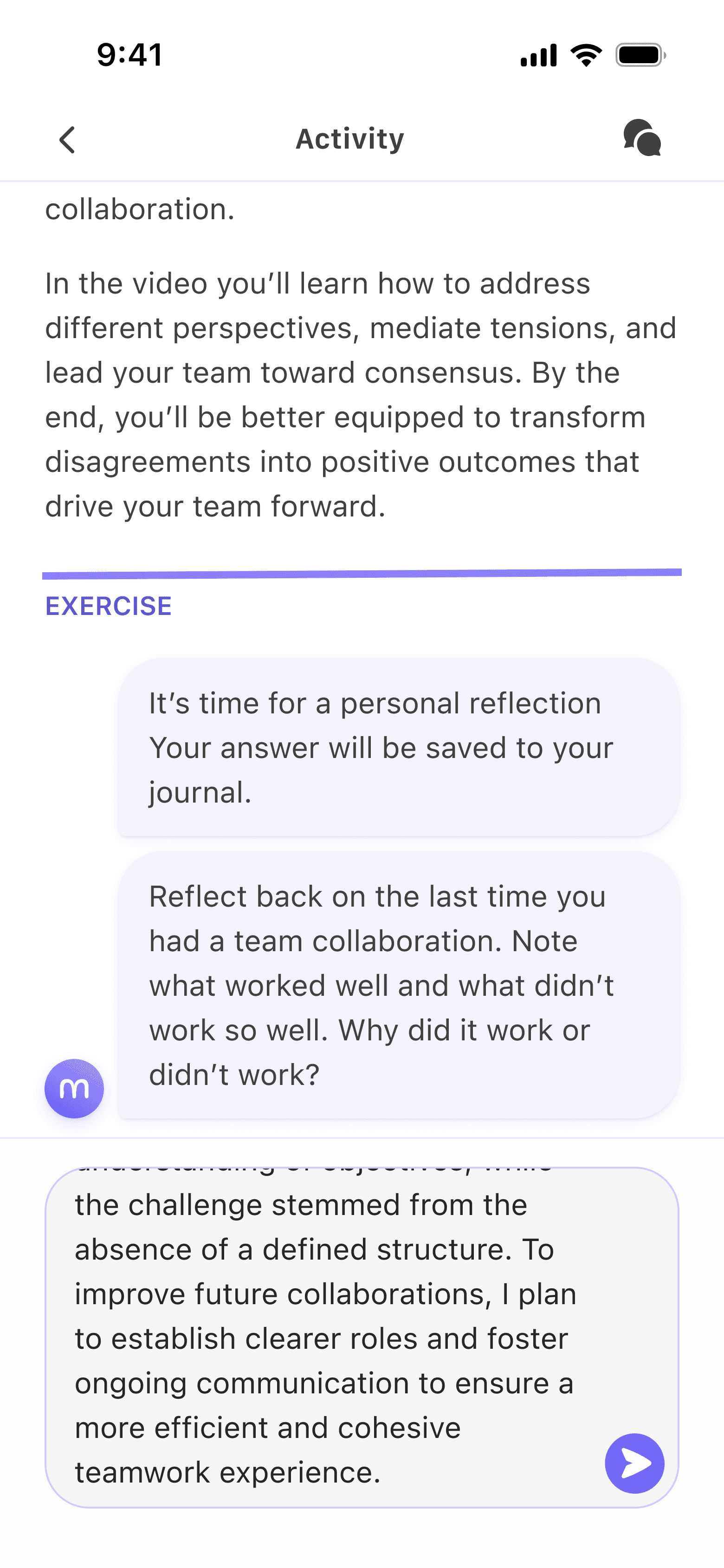
Journal
Gives users a moment to think critically about their learnings and saves it to their journal.
Interactive features that drive user engagement
Testing
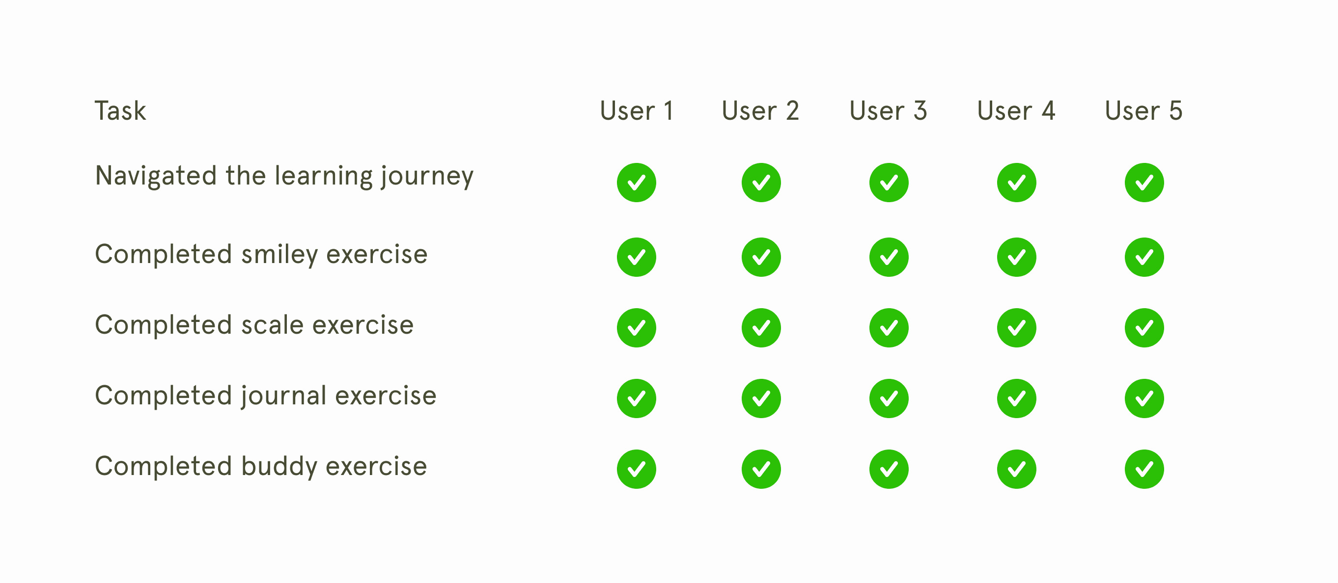
100% task success, the good and the bad
In testing with business professionals on a learning journey flow, all tasks were completed by all five users without interference. The buddy exercises were received very well by all, with one user noting that they were trying to do something similar to a buddy group in their company, underlining its usefulness.
But I did notice something that needed attention.
The good
Buddy exercise was well received
Users felt supported by the chat format.
The bad
Users lost track of progress
Users didn't notice the category icons.
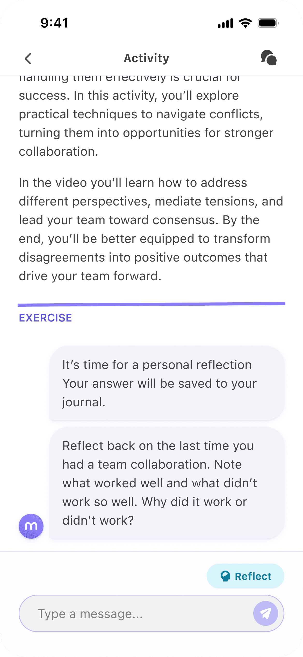
Redesign
Giving a better overview of the learning journey
Despite a task success rate of 100%, I noticed user lost track of their progress in the learning journey. They would complete several activities, defeating the purpose of microlearning. They barely noticed the categorization (share, reflect, act) of the activities.
I decided to bring them back to the learning journey screen and add colors to the share/reflect/act categories.
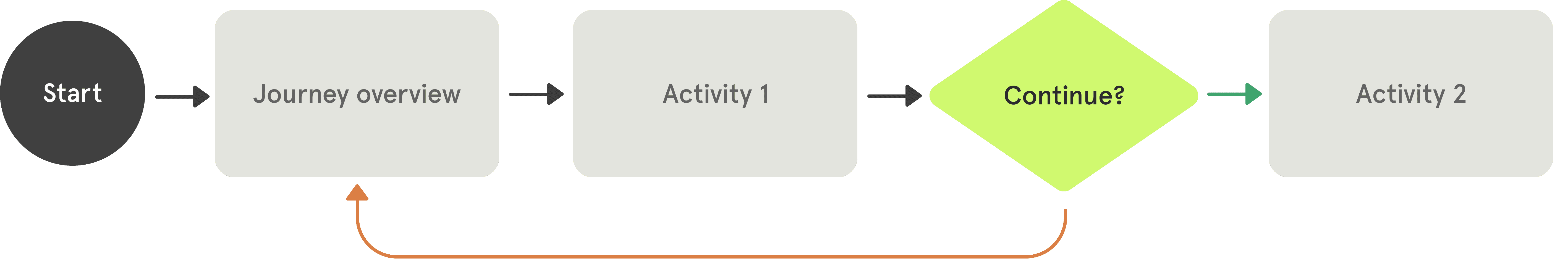
The user flow before had a continue CTA
The user flow after always directed them back to the journey screen
Testing
Users were uncertain if they were sharing with buddies
During live testing, course participants still enjoyed the buddy exercise and appreciated the variety in engagement types, noting that some required less mental effort while others required deep reflection. However, some users were uncertain if their answers were being shared with others or kept private in their journals.
The issue was later cemented in a co-design workshop, where most groups focused their work on the buddy exercise.
"I am unsure whether I am writing a reflection for myself or sharing with my buddy"
Quote from interview
ReDesign
Diversifying buddy and journal engagement.
To make the distinction clear, I added the category tags with colors from the journey screen to the exercise. The colors would create a higher visual hierarchy and catch the user's eye, making it harder for users to miss.
When I later tested it with a cohort of 35 users, none of them were confused about which was which.
There was so much more
What you have seen so far is only one part of the mobile app, but there was so much more, including a whole personality test, a design system from scratch, and an admin web app.
Here are some snippets to give you an idea.
LEarnings
It's not what they say, but why they say it
Stakeholders tend to come with very specific suggestions, and while some can be better than others, it's important to peel off a layer to understand why they are suggesting it. Often, there is a better solution to the concern.
Scoping is key
Working closely with the CTO and the engineering team, I learned that they make great allies when it comes to helping non-tech leadership understand feasibility and managing expectations of what is possible.